Communicating with color
3 March 2018
Some people think color is immaterial, not very important, especially in fashion. Others, like Leatrice Eiseman or “Ms. Color in America” and Director of the Pantone Color Institute, believe color exerts powerful forces on the human mind.
More than 20 years ago, when teaching at an occupational training center for women in Los Angeles, she began to obsess about color and even invented the “color clock”, whereby color changes because of light. In 1983 she published the book “Alive with color” which provoked the meeting with Pantone’s Larry Herbert.
Last October, Eiseman published her 10th book “The Complete Color Harmony, Pantone Edition” on the psychology of color. It analyses what personal colors say about you and the chromatic horoscope that results. “Blue people aspire to harmony, serenity, patience, perseverance and peace, and have a calming influence on other people,” she writes. “You are generally unflappable, even-tempered and reliable, a team player and good co-worker.”
Green? “You are the good citizen, concerned parent, involved neighbor, the joiner of clubs and organizations.
Yellow? “You are optimistic, hopeful and encourage others to do their best.”
You may think this is BS. You may say it lacks scientific rigor. But color psychology and the study of its impact reveal it has real impact on people and a great many take it seriously. Aspects like culture, emotion, physiology, personality, all have a role in how color is perceived (see www.thecolorexperience.ch). Today, with Pantone, color is a real business, the business of selling color, and each year the fashion world awaits the Institute’s prognostications and brands base their collections on them.
For the anecdote, Pantone launched its first color of the year in 1999, Cerulean Blue or the color of the millennium. It was used in Meryl Streep’s cerulean speech in “The Devil Wears Prada”.
Google’s blue was tested among 41 shades of blue for their sponsored links in 2009. Their final decision increased revenue, according to its CEO, by $200 million.
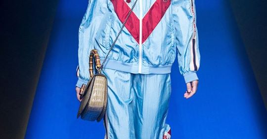
This year’s shade “Love Symbol No. 2” pays tribute to Prince and has been embraced in fashion shows by brands such as Gucci, Prada or Alberta Ferreti.
David Shah, editor and publisher of the “Pantone View Color Planner”, edits each February and August, the pigments and textile standards of 64 colors that forecast trends two years in advance. These often reflect the mood of the people. In the US, apparently they are into “accidental colors”, or colors that wouldn’t usually work together. Think pink and red, perhaps?
At I-DYLIC, our goal is to help people wear the colors and shapes that suit them, and institutions like Pantone or The Color Experience prove the importance of color in the business of fashion but also in the business of well being. So go ahead and mix and match your colors, just as long as the color tone close to your face brightens up your complexion!
©I-DYLIC. Article by Eleonore Vadon
More info on:http://nyti.ms/2EYvtjE